Creating a sanctuary of calm begins the moment someone steps through the door, and color plays a pivotal role in crafting that initial impression and sustaining a tranquil atmosphere. A spa isn’t just about the treatments; it’s about the entire sensory experience. The visual element, particularly the color palette, acts as a silent conductor, orchestrating feelings of peace, relaxation, and rejuvenation. Getting the color harmony right is essential for designing a space that truly feels like an escape.
Think of the spa environment you wish to create. Is it airy and coastal, grounded and earthy, or perhaps minimalist and serene? The colors you choose will be the building blocks of this identity. Harmonizing these colors means selecting shades that work together cohesively, creating a balanced and pleasing visual flow throughout the space, from the reception area to the treatment rooms and relaxation lounges.
The Foundation: Embracing Neutrals
Neutrals are the unsung heroes of spa design. They provide a necessary backdrop of calm, allowing other elements, including subtle textures and accent colors, to shine without overwhelming the senses. Far from being boring, neutrals offer incredible depth and versatility.
Consider the vast spectrum within neutrals:
- Whites: Crisp, clean whites suggest purity and spaciousness. Off-whites, ivory, and cream tones offer a softer, warmer approach, feeling less clinical and more inviting.
- Beiges and Taupes: These earthy neutrals connect the space to natural elements like sand and stone. They provide warmth and grounding, creating a cozy yet sophisticated feel. Look for complex beiges with subtle undertones – perhaps a hint of pink, green, or gray – to add sophistication.
- Grays: Gray offers incredible range, from soft, cloud-like light grays to deep, grounding charcoals. Warmer grays (greige) blend beautifully with natural wood tones, while cooler grays pair well with blues and greens for a more contemporary or coastal vibe. Gray provides a sense of stability and calm elegance.
Using neutrals strategically creates visual breathing room. They prevent bolder colors from becoming overpowering and help tie different zones of the spa together. A neutral base ensures longevity in design, allowing for easier updates with accessories or accent walls later on.
Drawing Inspiration from Nature’s Palette
Spas inherently aim to connect guests with a sense of well-being, often found in nature. Integrating colors drawn from the natural world is a powerful way to reinforce this connection and promote relaxation.
Soothing Blues
The color of the sky and sea, blue is almost universally associated with calmness and serenity. In a spa context, softer, muted blues are often most effective. Think of:
- Powder Blue: Light, airy, and expansive.
- Duck Egg Blue: A gentle blue with a hint of green, very calming.
- Muted Teal: Sophisticated and deeper than lighter blues, evoking tranquil waters.
- Gray-Blue: A complex, serene shade that pairs well with natural wood and stone.
Blues work exceptionally well in wet areas like hydrotherapy zones or treatment rooms where a feeling of cool cleanliness and tranquility is desired. Pair them with warm neutrals or natural wood to avoid a cold feeling.
Restorative Greens
Green speaks of growth, renewal, and the tranquility of nature. It’s a color the eye perceives with minimal strain, making it inherently restful. Consider shades like:
- Sage Green: Soft, grayish-green, incredibly soothing and versatile.
- Mint Green: Fresh and light, though best used subtly to avoid looking dated.
- Olive Green: Earthy, grounded, and sophisticated. Pairs beautifully with wood tones and terracotta accents.
- Moss Green: Deep and calming, evoking forest floors and shaded groves.
Greens are fantastic for relaxation lounges, reception areas, or any space where you want to foster a sense of balance and connection to the natural world. They combine well with beiges, creams, wood tones, and even soft blues.
Earthy Tones
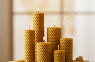
Beyond beiges and taupes, consider other earthy hues that provide warmth and grounding. Soft terracotta, muted clay tones, sandy yellows, and stone grays add depth and texture visually. These colors feel stable, nurturing, and inherently calming, connecting the space directly to the earth. They are excellent choices for creating a cocooning effect in treatment rooms or adding warmth to larger spaces.
Accents: Injecting Personality with Care
While tranquility is key, a purely neutral or nature-toned palette can sometimes feel monotonous. Accent colors, used judiciously, add points of interest and personality without disrupting the overall calm.
The key is subtlety and balance. Instead of bright, high-saturation colors which can be jarring in a spa, opt for:
- Muted versions of bolder colors: Think dusty rose instead of bright pink, soft coral instead of orange, or a deep plum instead of vibrant purple.
- Deep, rich tones: A deep teal, a warm terracotta, or a sophisticated ochre can add depth when used sparingly on a feature wall, in upholstery, or through accessories like cushions and throws.
- Metallics: Soft gold, brushed brass, or muted bronze can add a touch of luxury and warmth without being overly stimulating. Use them for fixtures, mirror frames, or subtle decorative elements.
Accents should complement the main palette, not compete with it. Use them to guide the eye, highlight architectural features, or add a touch of brand identity, but always ensure they contribute to the overall feeling of harmony.
Verified Principles for Spa Palettes: A truly harmonious spa color scheme hinges on balance and deliberate choices. Begin with a calming neutral foundation to establish serenity. Layer in hues inspired by the natural world, like blues and greens, to deepen the sense of peace. Finally, introduce accent colors sparingly to add character without sacrificing tranquility. Always evaluate how lighting and textures will influence the final perception of your chosen colors.
Color Harmony Strategies
How do you ensure your chosen colors work well together? Understanding basic color harmony principles helps.
Monochromatic Schemes
This approach uses variations in lightness and saturation of a single color. For instance, a palette might feature light sage green walls, medium sage upholstery, and deep moss green accents. This creates a very cohesive and sophisticated look, inherently calming due to its simplicity. The key is to use enough variation in tints, tones, and shades to create visual interest and avoid flatness. Texture plays a crucial role in monochromatic schemes.
Analogous Schemes
Analogous colors sit next to each other on the color wheel, such as blue, blue-green, and green. These combinations are naturally harmonious and often found in nature. A spa might use soft blues and greens together, perhaps grounded with a neutral like sandy beige. This approach offers more variation than monochromatic while maintaining a strong sense of calm and flow.
Subdued Complementary Schemes
Complementary colors sit opposite each other on the color wheel (e.g., blue and orange, green and red). In their pure forms, they create high contrast and energy, which is generally undesirable in a spa. However, using highly muted or desaturated versions can work beautifully. Think of a soft, dusty peach paired with a muted teal, or a pale lilac with a gentle sage green. Used carefully, these combinations can add subtle dynamism and sophistication.
The Influence of Light and Texture
Color doesn’t exist in a vacuum. How it appears is dramatically affected by light and texture.
Light: Natural daylight renders colors most accurately, but its quality changes throughout the day. Consider the orientation of rooms – north-facing rooms receive cooler light, while south-facing rooms get warmer light. Artificial lighting also plays a huge role. Warm white light (lower Kelvin) enhances reds, oranges, and yellows, creating a cozier feel. Cool white light (higher Kelvin) enhances blues and greens, appearing crisper. Dimmable lighting is essential in a spa to adjust the mood.
Texture: Texture affects how light reflects off a surface, influencing color perception.
- Smooth surfaces (like polished stone or high-gloss paint) reflect more light, making colors appear brighter and potentially colder.
- Matte surfaces (like flat paint or unpolished wood) absorb more light, making colors appear softer and deeper.
- Rough textures (like linen fabrics, rough-hewn wood, or natural stone) create shadows and highlights, adding depth and complexity to a color.
Bringing It All Together
Designing a spa palette is about creating an experience. Start by defining the desired mood. Select a neutral base, then layer in nature-inspired hues that support that mood. Choose accent colors carefully, considering their intensity and placement. Pay close attention to how light will interact with your choices and incorporate varied textures to add depth and sensory appeal. The goal is a cohesive, balanced environment that instantly signals relaxation and allows guests to unwind fully. A thoughtfully harmonized color palette is the foundation upon which a truly restorative spa experience is built.